

South Australian English Teachers Association
This was a live brief to re-vitalise the SAETA brand, creating a flexible identity which would remain recognisable across several publications.
Two new editions of the flagship journal Opinion and the second edition of All New Great Ideas for the Middle School Classroom have been published so far.
I’d like to thank SAETA for their vision and their faith.

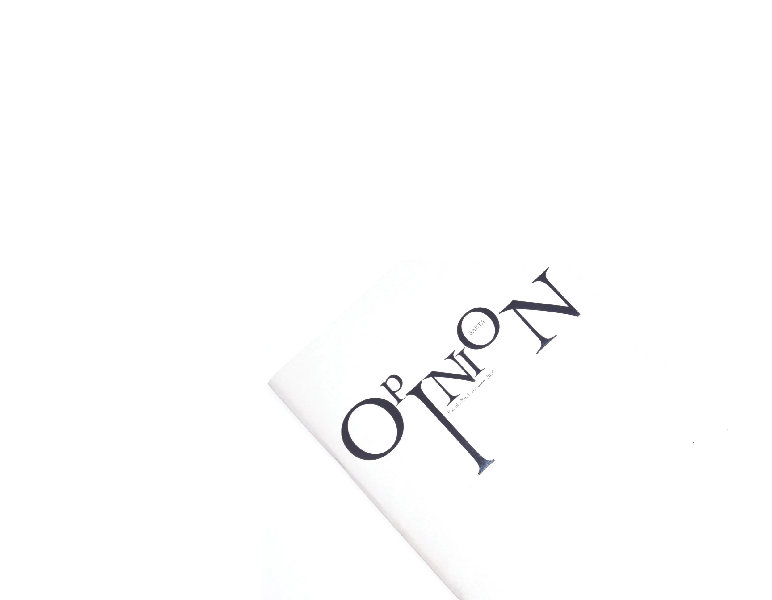
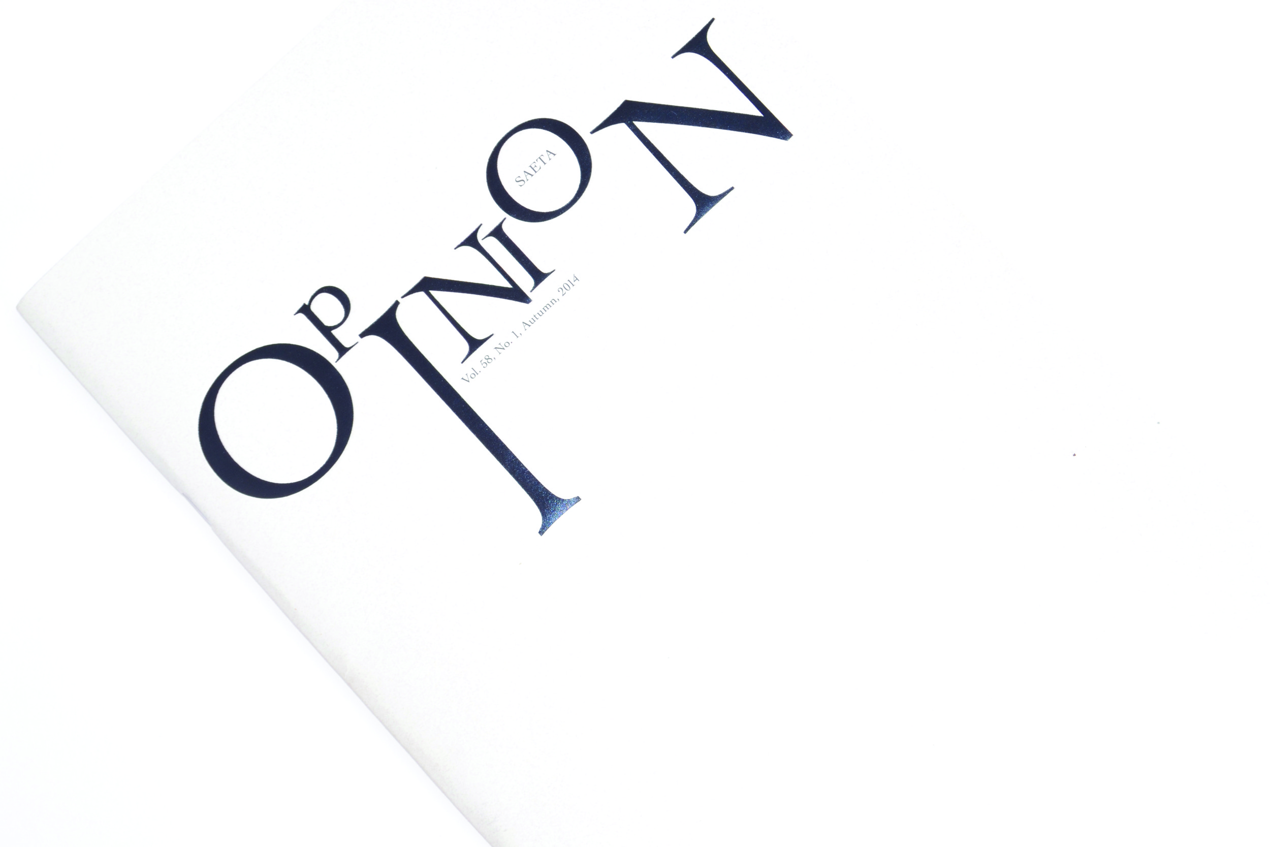
Design set up for press with printer's marks. The purple text is a foil, impressed into a soft natural paper. The colour of the paper changes subtly with each edition. The image on the back page is by a local photographer and helps keep the journal anchored to the region for its readership.

All New Great Ideas For the Middle School Classroom is a title that might be seen as an affliction by many designers. Here it becomes a virtue and the cover design pulls out the key words, providing a visual short cut for users trying to figure out what to call the book in conversation. Notice that the type remains consistent with all elements connected to the SAETA brand.

Sample spread showing how teaching resources have been clarified and condensed through careful arrangement of types of text. The Chapter number, government curriculum requirements and author are styled as chapter headings above the title. Further reading and notes for teachers use space in the margins. The primary text box is reduced to a more comfortable line-length than A4 would usually permit.

This spread is photographed from the final product. The book is printed on 113 gsm FSC clay coated silk finish paper, section stitched and case bound.
It looks very handsome and is selling well!

I had a little fun reversing out the text and background to create something a little less heavy on the back.

This photo reveals the UV spot which makes the text appear or disappear depending on how the light catches the cover. Its a clear varnish over watermelon orange print on white paper...
