















Starting with the basic means of communication, this letterhead was used for all mail-based communications, from letters soliciting donations to letters of thanks to those who chose to give or buy.

An economical way to exist in the digital world this one-page web presence acts as a portal to a much richer Facebook page as well as offering key information, links to interactive maps, social media & more.
Click here to open the site in a new window.

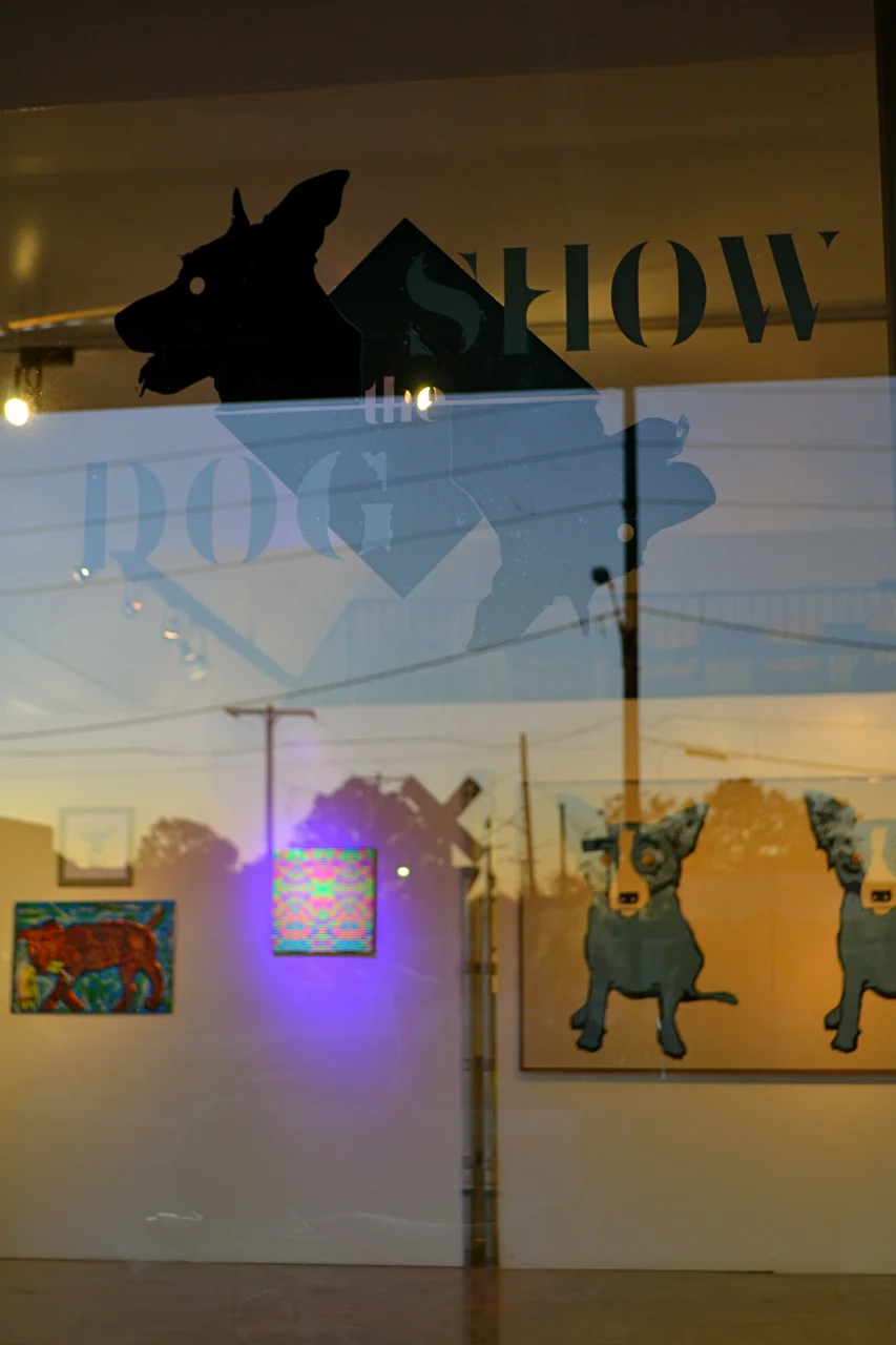
This shot is taken from the inside of the gallery looking out at dusk. My thanks to Wickes Helmboldt for sharing this photograph - and for her kind words regarding the design.
I'd also like to thank Ginette Bone who worked out how to assemble the vectors to make this work in my absence.
I think it was worth the effort. What do you think?

This medium sized poster (US Ledger) draws together the early imagery from the letterhead and webpage with the more developed palette found on the cover of the exhibition catalogue.
Rather than privilege a single work, I used the brand and the artist's names to do the heavy lifting.
The vibrating colours make this a very visible statement - despite being darker than might be usual for a poster.

A one-person performance, scheduled as part of the fundraiser, is here given a visual treatment as part of the brand...

This piece combines elements from the poster with a key work most generously submitted as part of the show. I worked to maintain the brand-feel while deferring to the striking palette of the artwork itself.

Thomasine Bartlett
This performer, dressed in specially made midcentury-nostalgia-style uniform made for the occasion, presents hot-dogs to gallery goers on roller-skates at the opening.

The badge motif and striking colours make help tie this cover to the brand.
More subtly, the shadow of a dog used in the yellow strip to the left of the front cover is actually the shadow of Thomas Mann's DOGGIT sculpture - which was made and donated by the artist for the exhibition.
This work appears more fully on the e-vite and the Facebook Format e-vite.

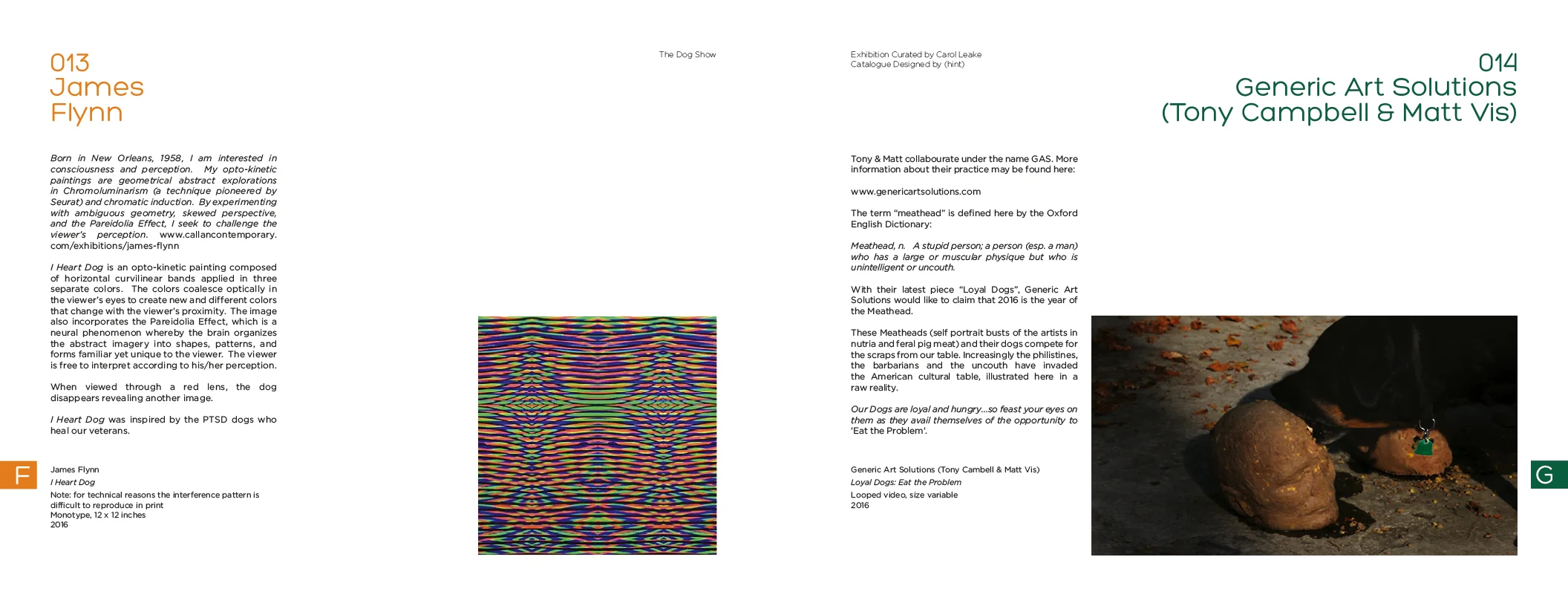
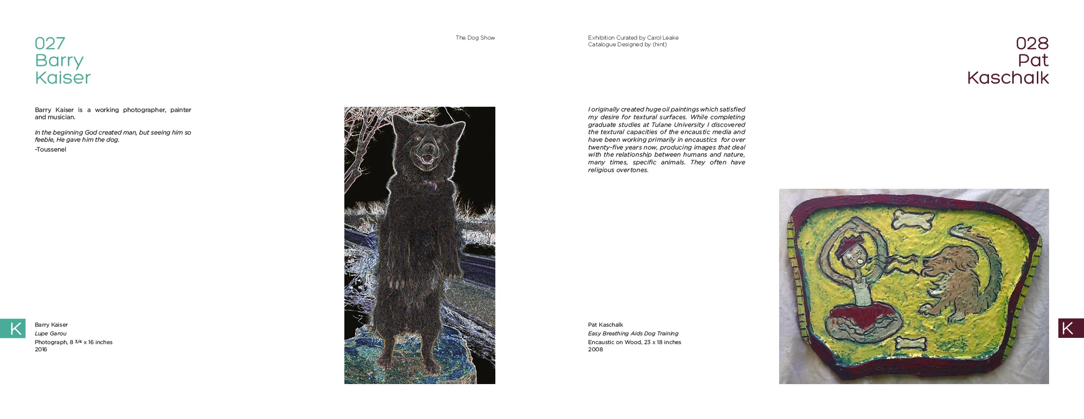
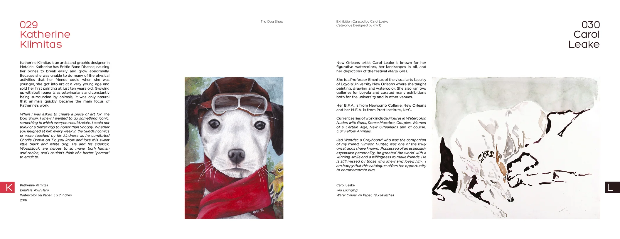
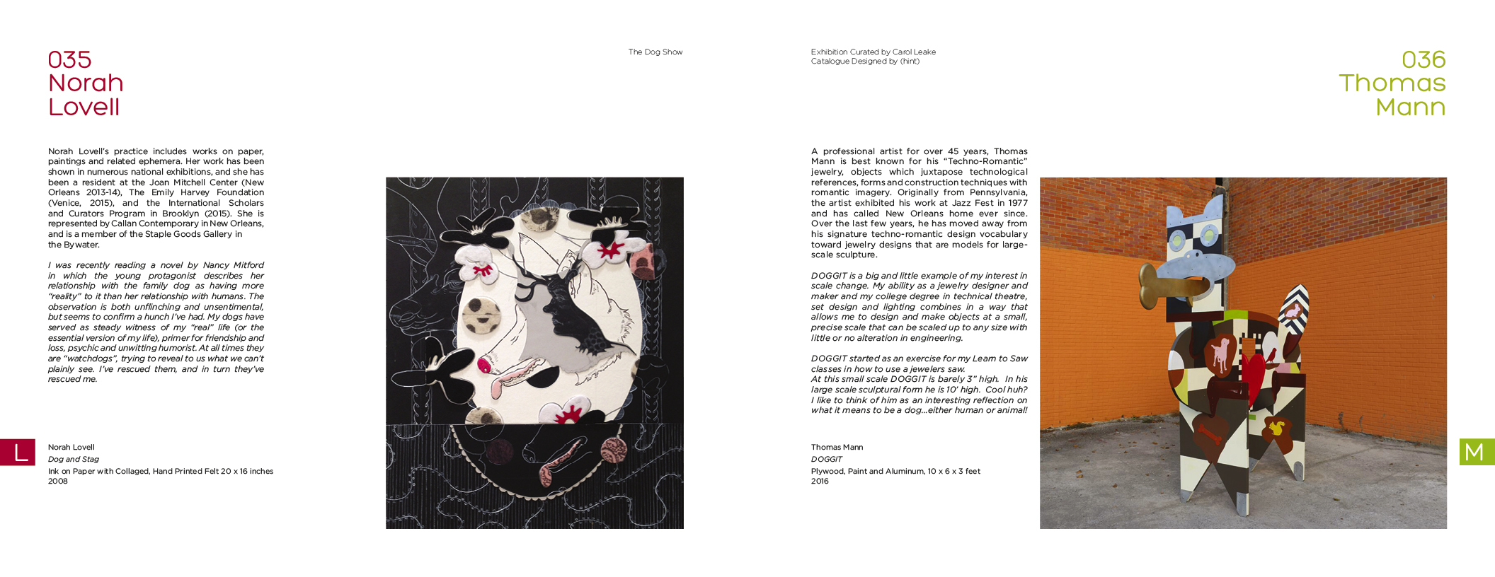
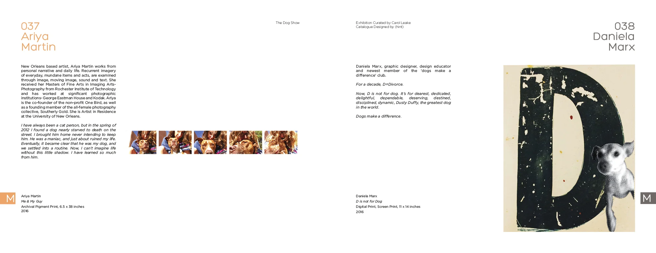
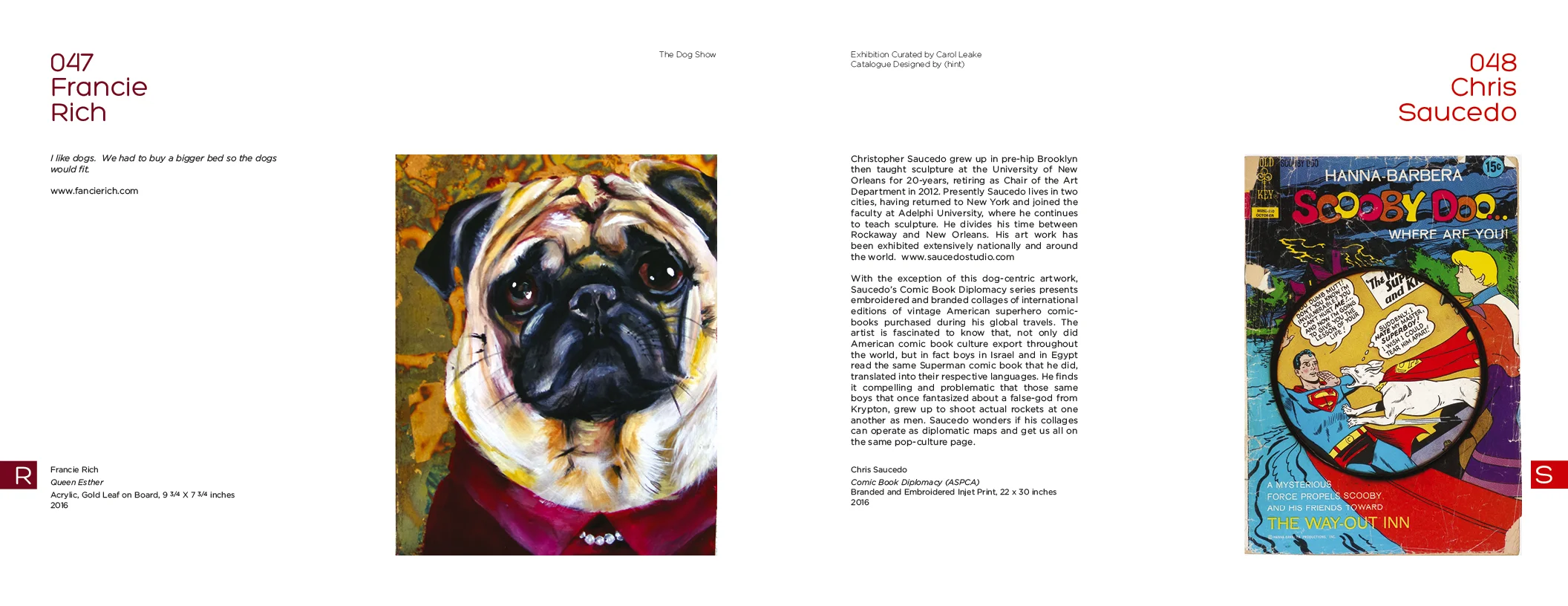
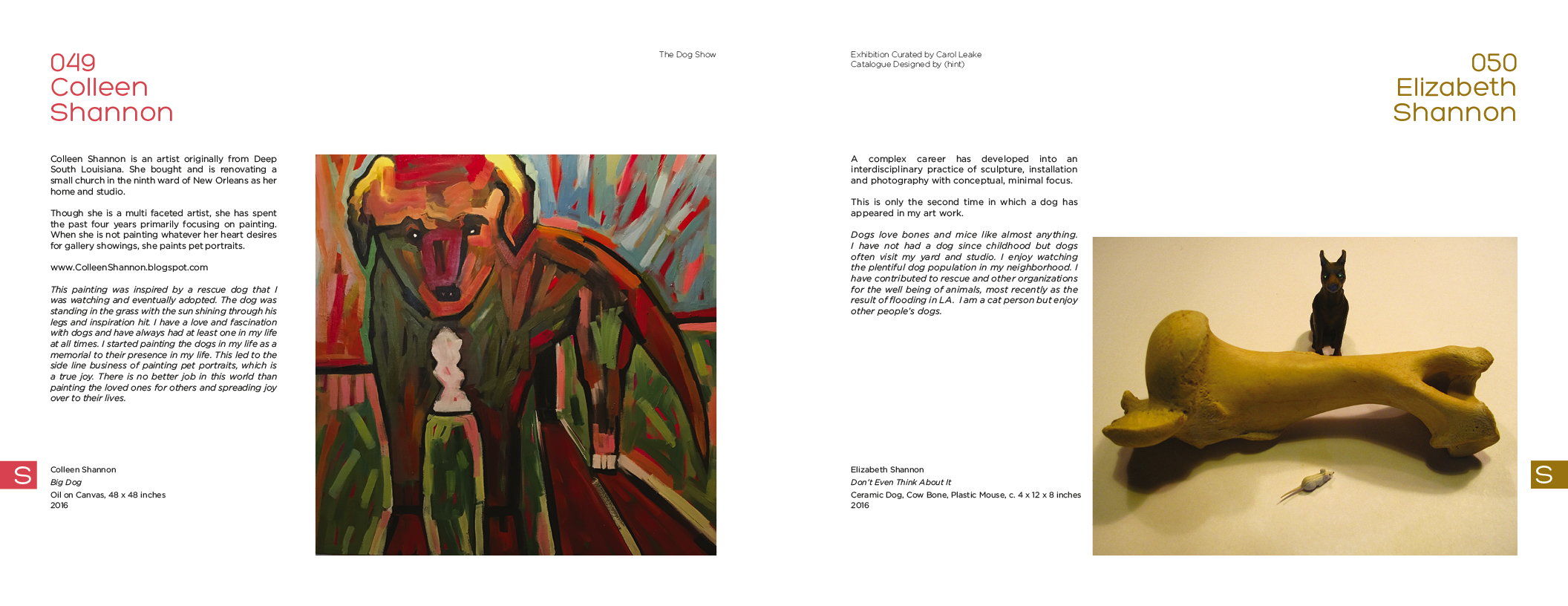
Whilst the headlines on each page sit farthest from the spine, as the catalogue unfolds you will notice that each page follows the same format below the heading - with the copy on the left and the image on the right, regardless of whether the page is left or right of the central fold.
The catalogue is sequenced alphabetically (everyone is given equal voice and there are no reasons to group works together since they all have the same theme and are all contemporary to one another). The first letter of the relevant surname is shown clearly on the outside of the page to help the user to navigate the book. Each letter is reversed out over a block of a key colour from the work represented on the page.
This special colour is repeated in the treatment of the type in the headline.
Labels are introduced as consistently as possible both in their own formatting and in relation to the other elements on the page.
Working with the curator and Mele Printing, Covington, LA, every effort was made to ensure that the colours are as true as possible and always internally consistent.
Quality papers were specified to do justice to the work shown.
